
Weraldiz - Stimmen einer vergessenen Welt

/*Eine ==========================================================================Welt, LANDING.CSSdie —nur Landingim pageMiteinander onlyallen (loadedSeins via PHP)
Depends on core.css (variables) and components.css (shared button base).
NO :root block — all tokens live in core.css.
========================================================================== */existiert.
/*Wahrheit, ------------------------------------------------------------------------Beziehung und der Preis des Erkennens formen Wirklichkeiten.
Fünf Welten, eine Wahrheit
<!-- 0.Featured: PAGE-SPECIFIC VARIABLES
-------------------------------------------------------------------------- */
:root {
--landing-content-max: 1352px;
--landing-reading-max: 800px;
--landing-section-pad: clamp(48px, 8vw, 100px);
--landing-inline-pad: clamp(16px, 4vw, 32px);
--transition-base: all .4s ease;
--transition-smooth: all .5s cubic-bezier(.55, .25, .50, .85);
}
/* --------------------------------------------------------------------------
@keyframes shimmer {
0% { left: -100%; opacity: .7; }
100% { left: 200%; opacity: 0; }
}
@keyframes gentle-pulse {
0%, 100% {
filter: drop-shadow(0 2px 4px rgba(0, 0, 0, .3))
drop-shadow(0 0 8px rgba(207, 204, 186, .4))
drop-shadow(0 0 16px rgba(207, 204, 186, .2));
}
50% {
filter: drop-shadow(0 2px 4px rgba(0, 0, 0, .3))
drop-shadow(0 0 10px rgba(207, 204, 186, .5))
drop-shadow(0 0 20px rgba(207, 204, 186, .3));
}
}
@keyframes hero-drift {
0%, 100% { background-position: 50% 50%; }
50% { background-position: 52% 48%; }
}
@keyframes triptych-reveal {
from { clip-path: inset(100% 0 0 0); opacity: 0; }
to { clip-path: inset(0 0 0 0); opacity: 1; }
}
/* --------------------------------------------------------------------------
2. TRI-LAYOUT OVERRIDES — full-width landing
-------------------------------------------------------------------------- */
#content {
padding-inline: 0 !important;
}
.tri-layout-container {
display: block !important;
max-width: 100% !important;
column-gap: 0 !important;
padding: 0 !important;
margin: 0 !important;
}
.tri-layout-sides,
.tri-layout-mobile-tabs {
display: none !important;
}
.tri-layout-middle {
padding: 0 !important;
max-width: 100% !important;
width: 100% !important;
}
.tri-layout-middle-contents {
max-width: 100% !important;
width: 100% !important;
padding: 0 !important;
}
/* BookStack .mt-m spacer above content */
.mt-m {
margin-top: 0 !important;
}
.content-wrap.card {
max-width: 100% !important;
border: none !important;
border-radius: 0 !important;
box-shadow: none !important;
padding: 0 !important;
margin: 0 !important;
background: transparent !important;
}
.content-wrap::before {
display: none !important;
}
/* BookStack page-content wrapper — remove width cap */
.page-content {
max-width: 100% !important;
width: 100% !important;
margin: 0 !important;
padding: 0 !important;
}
h1#bkmrk-page-title {
display: none !important;
}
/* --------------------------------------------------------------------------
3. SECTION WIDTH CONTAINERS
-------------------------------------------------------------------------- */
.landing-contained {
max-width: var(--landing-content-max);
margin-inline: auto;
padding-inline: var(--landing-inline-pad);
}
/* ==========================================================================
4. HERO SECTION
Texture/gradient based — no heavy image, fast LCP.
Radial vignette creates depth. Logo is focal anchor.
========================================================================== */
.landing-hero {
position: relative;
display: flex;
flex-direction: column;
align-items: center;
justify-content: center;
min-height: 80vh;
min-height: 80svh;
padding: clamp(100px, 15vh, 160px) var(--landing-inline-pad) clamp(80px, 12vh, 140px);
text-align: center;
overflow: hidden;
/* Layered texture + radial vignette */
background:
radial-gradient(ellipse 70% 55% at 50% 40%,
rgba(175, 170, 140, .06) 0%,
transparent 70%),
radial-gradient(ellipse 120% 80% at 50% 100%,
rgba(0, 0, 0, .04) 0%,
transparent 50%),
var(--texture-light) repeat;
background-size: auto, auto, 200px;
animation: hero-drift 30s ease-in-out infinite;
}
html.dark-mode .landing-hero {
background:
radial-gradient(ellipse 70% 55% at 50% 40%,
rgba(197, 193, 172, .03) 0%,
transparent 70%),
radial-gradient(ellipse 120% 80% at 50% 100%,
rgba(0, 0, 0, .15) 0%,
transparent 50%),
var(--texture-dark) repeat;
background-size: auto, auto, 150px;
}
/* Bottom fade into page bg */
.hero-fade {
position: absolute;
bottom: 0;
left: 0;
right: 0;
height: 120px;
background: linear-gradient(to bottom, transparent, var(--light-bg-primary));
pointer-events: none;
z-index: 1;
}
html.dark-mode .hero-fade {
background: linear-gradient(to bottom, transparent, var(--dark-bg-primary));
}
/* --------------------------------------------------------------------------
4a. HERO LOGO — preserved from original, repositioned
-------------------------------------------------------------------------- */
.landing-hero .hero-logo-overlap {
position: relative;
z-index: 10;
display: flex;
justify-content: center;
margin-bottom: 0;
pointer-events: none;
}
.landing-hero .hero-logo {
display: flex;
align-items: center;
justify-content: center;
width: 300px;
}
.magical-logo-container {
position: relative;
display: inline-flex;
align-items: center;
justify-content: center;
width: auto;
height: auto;
margin: 0 auto;
cursor: pointer;
pointer-events: auto;
}
.logo-glow-background {
position: absolute;
inset: 0;
background: radial-gradient(circle,
rgba(207, 204, 186, .2) 0%,
rgba(175, 170, 140, .1) 45%,
rgba(190, 186, 161, 0) 70%);
border-radius: 50%;
z-index: 1;
opacity: .6;
pointer-events: none;
}
.magical-aura {
position: absolute;
inset: 0;
background: radial-gradient(circle,
rgba(190, 186, 161, .06) 0%,
rgba(207, 204, 186, .03) 40%,
rgba(207, 204, 186, 0) 70%);
filter: blur(12px);
border-radius: 50%;
z-index: 0;
opacity: .5;
pointer-events: none;
}
.magical-logo {
position: relative;
z-index: 2;
width: 100%;
max-width: 300px;
height: auto;
filter: drop-shadow(0 2px 4px rgba(0, 0, 0, .3))
drop-shadow(0 0 8px rgba(207, 204, 186, .4))
drop-shadow(0 0 16px rgba(207, 204, 186, .2));
}
.magical-logo-container::before,
.magical-logo-container::after {
content: '';
position: absolute;
width: 4px;
height: 4px;
background: radial-gradient(circle, rgba(207, 204, 186, .8) 0%, transparent 70%);
border-radius: 50%;
opacity: 0;
pointer-events: none;
z-index: 0;
}
.magical-logo-container::before { top: 20%; left: 15%; }
.magical-logo-container::after { bottom: 25%; right: 20%; }
/* --------------------------------------------------------------------------
4b. HERO BODY — tagline, subtitle, CTA
-------------------------------------------------------------------------- */
.hero-body {
position: relative;
z-index: 10;
max-width: 640px;
margin-top: clamp(24px, 4vw, 40px);
}
.hero-tagline {
font-family: var(--font-heading);
font-size: clamp(1.1rem, 2.8vw, 1.7rem);
font-weight: 700;
line-height: 1.35;
color: var(--light-text-primary);
margin-bottom: clamp(8px, 2vw, 16px);
}
html.dark-mode .hero-tagline {
color: var(--dark-accent-primary);
}
.hero-subtitle {
font-size: clamp(.85rem, 1.4vw, 1rem);
line-height: 1.6;
color: var(--light-text-secondary);
margin-bottom: clamp(24px, 4vw, 36px);
}
html.dark-mode .hero-subtitle {
color: var(--dark-text-secondary);
}
.hero-cta {
display: inline-flex;
width: auto;
padding: 14px 32px;
}
/* ==========================================================================
5. MOOD TRIPTYCH
Three atmospheric images, no text. Full viewport width.
Pure visual rhythm break — anti-banner-blindness.
========================================================================== */
.mood-triptych {
display: grid;
grid-template-columns: repeat(3, 1fr);
width: 100%;
overflow: hidden;
}
.mood-cell {
position: relative;
min-height: clamp(150px, 20vw, 280px);
background-size: cover;
background-position: center;
background-repeat: no-repeat;
filter: sepia(12%) saturate(85%) brightness(1.05);
transition: filter .6s ease, transform .6s ease;
overflow: hidden;
}
html.dark-mode .mood-cell {
filter: sepia(8%) saturate(90%) brightness(.8);
}
.mood-cell:hover {
filter: sepia(0%) saturate(110%) brightness(1.1);
z-index: 1;
}
html.dark-mode .mood-cell:hover {
filter: sepia(0%) saturate(100%) brightness(.9);
}
/* Shimmer overlay on hover */
.mood-cell::after {
content: '';
position: absolute;
top: 0;
left: -100%;
width: 50%;
height: 100%;
background: linear-gradient(to right,
rgba(255, 255, 255, 0) 0%,
rgba(255, 255, 255, .2) 50%,
rgba(255, 255, 255, 0) 100%);
transform: skewX(-25deg);
opacity: 0;
transition: opacity .3s ease;
}
html.dark-mode .mood-cell::after {
background: linear-gradient(to right,
rgba(197, 193, 172, 0) 0%,
rgba(197, 193, 172, .12) 50%,
rgba(197, 193, 172, 0) 100%);
}
.mood-cell:hover::after {
opacity: 1;
animation: shimmer 3s infinite;
}
/* Triptych images — swap URLs as needed */
.mood-cell--sky { background-image: url('https://weraldiz.de/uploads/images/gallery/2026-02/nightsky01.webp'); }
.mood-cell--city { background-image: url('https://weraldiz.de/uploads/images/gallery/2026-02/cel-marish-s.webp'); }
.mood-cell--wild { background-image: url('https://weraldiz.de/uploads/images/gallery/2026-02/durphan-s.webp'); }
@mediaAuwharin (max-width: 640px) {
.mood-triptych {
grid-template-columns: 1fr;
}
.mood-cell {
min-height: clamp(120px, 30vw, 180px);
}
}
/* ==========================================================================
6. INTERLUDE
Narrow philosophical line. Breathing room between sections.
========================================================================== */
.interlude {
max-width: var(--landing-reading-max);
margin-inline: auto;
padding: var(--landing-section-pad) var(--landing-inline-pad);
text-align: center;
}
.interlude-line {
width: 60px;
height: 2px;
margin: 0 auto 24px;
background: linear-gradient(90deg, transparent, var(--primary-color), transparent);
}
.interlude-line:last-child {
margin: 24px auto 0;
}
.interlude-text {
font-family: var(--font-heading);
font-size: clamp(1rem, 2.5vw, 1.4rem);
font-weight: 700;
line-height: 1.5;
color: var(--primary-color);
letter-spacing: .02em;
}
.interlude-text--small {
font-size: clamp(.9rem, 2vw, 1.15rem);
font-weight: 400;
font-family: var(--font-body);
color: var(--light-text-secondary);
font-style: italic;
}
html.dark-mode .interlude-text--small {
color: var(--dark-text-secondary);
}
/* ==========================================================================
7. CULTURE SECTION
Grid layout with featured first card + 4 equal cards.
========================================================================== */
.culture-section {
max-width: var(--landing-content-max);
margin-inline: auto;
padding-inline: var(--landing-inline-pad);
padding-bottom: var(--landing-section-pad);
}
/* --------------------------------------------------------------------------
7a. SHARED CARD STYLES
-------------------------------------------------------------------------- */
.culture-card {
position: relative;
background: var(--texture-light) repeat;
border-radius: 12px;
overflow: hidden;
box-shadow: var(--neu-shadow);
transition: var(--transition-base);
transform: translateZ(0);
}
html.dark-mode .culture-card {
background: var(--texture-dark) repeat;
background-size: 150px;
}
.culture-card:hover {
box-shadow: var(--neu-shadow-hover);
}
/* Animated gradient border */
.culture-card::before {
content: '';
position: absolute;
inset: 0;
border-radius: 12px;
padding: 2px;
background: linear-gradient(45deg,
rgba(175, 170, 140, 0) 0%,
rgba(175, 170, 140, .6) 25%,
rgba(207, 180, 124, .4) 50%,
rgba(175, 170, 140, .6) 75%,
rgba(175, 170, 140, 0) 100%);
-webkit-mask: linear-gradient(#fff 0 0) content-box, linear-gradient(#fff 0 0);
-webkit-mask-composite: xor;
mask-composite: exclude;
opacity: .7;
z-index: 3;
animation: border-pulse 3s ease-in-out infinite;
pointer-events: none;
}
.culture-card:hover::before {
opacity: 1;
animation-duration: 2s;
}
/* --------------------------------------------------------------------------
7b. CARD IMAGE
-------------------------------------------------------------------------- */
.culture-card__image {
min-height: 220px;
background-size: cover;
background-position: center 20%;
background-repeat: no-repeat;
filter: sepia(15%) saturate(85%) brightness(1.05);
transition: var(--transition-smooth);
position: relative;
overflow: hidden;
box-shadow: var(--img-shadow);
}
html.dark-mode .culture-card__image {
filter: sepia(10%) saturate(90%) brightness(.85);
}
.culture-card:hover .culture-card__image {
filter: sepia(5%) saturate(100%) brightness(1.1);
box-shadow: var(--img-shadow-hover);
}
html.dark-mode .culture-card:hover .culture-card__image {
filter: sepia(5%) saturate(100%) brightness(.9);
}
/* Shimmer overlay */
.culture-card__image::after {
content: '';
position: absolute;
top: 0;
left: -100%;
width: 50%;
height: 100%;
background: linear-gradient(to right,
rgba(255, 255, 255, 0) 0%,
rgba(255, 255, 255, .25) 50%,
rgba(255, 255, 255, 0) 100%);
transform: skewX(-25deg);
opacity: 0;
transition: opacity .3s ease;
}
.culture-card:hover .culture-card__image::after {
opacity: 1;
animation: shimmer 3s infinite;
}
/* Culture image assignments (reuse from original) */
.kulturen-image { background-image: url('https://weraldiz.de/uploads/images/gallery/2026-02/valgerd-s.webp'); }
.kosmologie-image { background-image: url('https://weraldiz.de/uploads/images/gallery/2026-02/tuomo02-s.webp'); }
.reise-image { background-image: url('https://weraldiz.de/uploads/images/gallery/2026-02/mikel-s.webp'); }
.spiritualitat-image { background-image: url('https://weraldiz.de/uploads/images/gallery/2026-02/turms-s.webp'); }
.void-image { background-image: url('https://weraldiz.de/uploads/images/gallery/2026-02/veyn-s.webp'); }
/* --------------------------------------------------------------------------
7c. CARD BODY
-------------------------------------------------------------------------- */
.culture-card__body {
padding: clamp(20px, 3vw, 30px);
position: relative;
z-index: 2;
}
.culture-card__title {
margin: 0 0 12px;
font-size: 1.3em;
color: var(--primary-color);
font-family: var(--font-heading);
font-weight: 700;
position: relative;
display: inline-block;
}
/* Underline reveal on hover */
.culture-card__title::after {
content: '';
position: absolute;
bottom: -4px;
left: 0;
width: 0;
height: 2px;
background: linear-gradient(90deg, var(--primary-color), var(--primary-color-hover));
transition: width .6s ease;
}
.culture-card:hover .culture-card__title::after {
width: 100%;
}
.culture-card__text {
margin-bottom: 12px;
line-height: 1.6;
font-size: .9rem;
}
.culture-card__question {
font-weight: 900;
font-style: italic;
color: var(--primary-color);
font-size: .85rem;
line-height: 1.5;
}
/* --------------------------------------------------------------------------
7d. FEATURED CARD — spans full width, internal 2-colwidth) -------------------------------------------------------------------------->
*/<div .class="culture-card culture-card--featured {container-slide-left">
display:<div grid;
grid-template-columns: 1fr 1fr;
margin-bottom: clamp(16px, 3vw, 28px);
}
.culture-card--featured .class="culture-card__image {kulturen-image"></div>
min-height:<div 300px;
border-radius: 12px 0 0 12px;
}
.culture-card--featured .class="culture-card__body {text-fade-up-delay">
display:<h4 flex;class="culture-card__title">Auwharin</h4>
flex-direction:<p column;class="culture-card__text">In justify-content:Wolfsthal center;dampft }
.Met, während aus Zeruko Hiri die Argitari die Lehre der Himmlischen Heerscharen in die Lande tragen. Hier treffen uralte Stammesgesetze auf Rätsel, die älter sind als die Sterne.</p>
<p class="culture-card--featuredcard__question">Warum .culture-card__titlesprachen {die font-size:Argitari 1.5em;niemals }
.culture-card--featuredihrer .culture-card__textHeimat?</p>
{</div>
font-size:</div>
.95rem;
}
@media (max-width: 768px) {
.culture-card--featured {
grid-template-columns: 1fr;
}
.culture-card--featured .culture-card__image {
min-height: 200px;
border-radius: 12px 12px 0 0;
}
}
/* ------------------------------------------------------------------------<!-- 7e. CULTURE GRID — remaining 4Regular cards -------------------------------------------------------------------------->
*<div class="culture-grid">
<div class="culture-card fade-in">
<div class="culture-card__image kosmologie-image"></div>
.<div class="culture-gridcard__body {text-fade-up-delay">
display:<h4 grid;class="culture-card__title">Erek grid-template-columns:Noan</h4>
repeat(auto-fit,<p minmax(min(100%,class="culture-card__text">Über 300px),der 1fr));weiten gap:Tundra clamp(16px,hallen 3vw,Trommelschläge 28px);wider, }
/*Weraldiz ==========================================================================ruht 8.unter LIBRARYzwei FEATURE
Split image + text CTA. Dual-image reveal (clip-path).
========================================================================== */
.library-feature {
max-width: var(--landing-content-max);
margin-inline: auto;
padding-inline: var(--landing-inline-pad);
display: grid;
grid-template-columns: 1fr 1fr;
gap: 0;
border-radius: 12px;
overflow: hidden;
background: var(--bg-primary);
box-shadow: var(--neu-shadow);
position: relative;
transition: var(--transition-base);
transform: translateZ(0);
}
.library-feature:hover {
box-shadow: var(--neu-shadow-hover);
}
/* Border pulse */
.library-feature::before {
content: '';
position: absolute;
inset: 0;
border-radius: 12px;
padding: 2px;
background: linear-gradient(45deg,
rgba(175, 170, 140, 0) 0%,
rgba(175, 170, 140, .6) 25%,
rgba(207, 180, 124, .4) 50%,
rgba(175, 170, 140, .6) 75%,
rgba(175, 170, 140, 0) 100%);
-webkit-mask: linear-gradient(#fff 0 0) content-box, linear-gradient(#fff 0 0);
-webkit-mask-composite: xor;
mask-composite: exclude;
opacity: .7;
z-index: 5;
animation: border-pulse 3s ease-in-out infinite;
pointer-events: none;
}
.library-feature:hover::before {
opacity: 1;
animation-duration: 2s;
}
/* --------------------------------------------------------------------------
8a. LIBRARY IMAGESonnen — dual-imageverborgen, reveal
-------------------------------------------------------------------------- */
.library-feature__image {
position: relative;
overflow: hidden;
min-height: 300px;
}raunend.
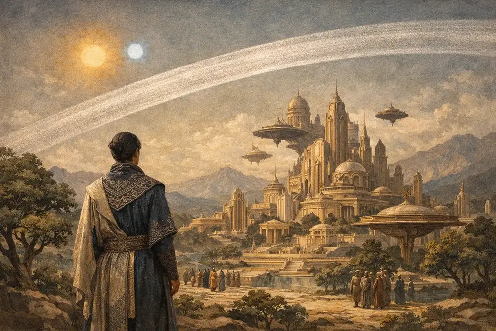
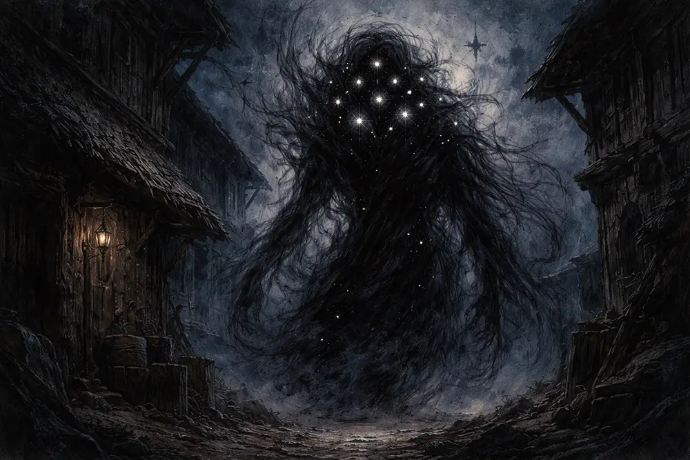
Was dich erwartet
.library-feature__img-primary,Weraldiz .library-feature__img-secondaryruht {unter position:zwei absolute;Sonnen inset:– 0;verborgen, width:raunend: 100%;Was height:wissen 100%;wir object-fit:wirklich? cover;Und object-position:was center;kostet transition:die filter 1.2s ease;
}Wahrheit?
Für die Hüter der Geheimnisse
.library-feature__img-primaryAls {Spielleiter filter:wirst blur(0);du z-index:zum 1;Wächter }verborgener Wahrheiten – jener Erkenntnisse, die im Schatten der sichtbaren Welt lauern. Hier findest du die Fäden, die das Gewebe der Realität zusammenhalten, und die Risse, durch die das Unmögliche hindurchsickert.
.library-feature__img-secondary
/* Hero elements: visible by default (above fold, no scroll trigger) */
.landing-hero .hero-logo-overlap,
.landing-hero .hero-body {
opacity: 1;
transform: none;
}
/* Reduced motion: skip all entrance animations */
@media (prefers-reduced-motion: reduce) {
.fade-in,
.text-fade-up-delay,
.container-slide-left,
.container-slide-right {
opacity: 1 !important;
transform: none !important;
transition: none !important;
}
}
/* ==========================================================================
13. RESPONSIVE — Tablet (≤1024px)
========================================================================== */
@media (max-width: 1024px) {
.culture-card__image {
min-height: 180px;
}
.culture-card--featured .culture-card__image {
min-height: 250px;
}
}
/* ==========================================================================
14. RESPONSIVE — Mobile (≤768px)
========================================================================== */
@media (max-width: 768px) {
.landing-hero {
min-height: 70vh;
min-height: 70svh;
}
.landing-hero .hero-logo {
width: 220px;
}
.magical-logo {
max-width: 220px;
}
.magical-logo-container::before,
.magical-logo-container::after {
display: none;
}
.hero-cta {
width: 100%;
max-width: 280px;
}
.culture-card__image {
min-height: 200px;
}
.dm-container {
max-width: 100%;
}
}
/* ==========================================================================
15. RESPONSIVE — Small mobile (≤480px)
========================================================================== */
@media (max-width: 480px) {
.landing-hero {
min-height: 65vh;
min-height: 65svh;
}
.landing-hero .hero-logo {
width: 180px;
}
.magical-logo {
max-width: 180px !important;
}
.mood-cell {
min-height: 120px;
}
.culture-card--featured .culture-card__title {
font-size: 1.25em;
}
.culture-card__title {
font-size: 1.15em;
}
.culture-card__text,
.culture-card__question {
font-size: .85rem;
}
}
/* ==========================================================================
16. RESPONSIVE — Very small (≤320px)
========================================================================== */
@media (max-width: 320px) {
.landing-hero .hero-logo {
width: 140px;
}
.magical-logo {
max-width: 140px !important;
}
.mood-cell {
min-height: 100px;
}
}